Practical tips for artists for the best printed result
NOTE from site: This post was written by David den Ouden, who’s worked on all 3 of the Doe Het Niet Zelf Dutch Graphic Novel weekends. It has not be further edited by the site owner.
If you want to publish a graphic novel made in 48 hours, you need 2 things:
- Speed (so you can create as many pages as possible)
- High quality art work (you can publish)
‘Just’ creating two page spreads is not enough. The art work needs to be scanned (if on paper), processed and made ready for print.
Based on experiences with GNW Utrecht 2019, GNW Haarlem 2020, and GNW Amsterdam 2021, we had some lessons learned. So we have some practical tips.
Sketching and setting up the page
If you work on paper:
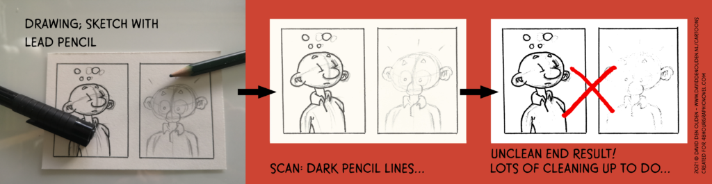
- You don’t want lead pencil sketches on the final art work;
- Erasing takes a lot of time, so we can’t do that (because we need speed).
- Pencil is graphite and is highly reflective. Even light pencil lines show up quite dark in scans.
- Exception: if it is your style of art to always leave your pencil sketches visible in the final art work, go for it.
- So DO NOT sketch with lead pencil on the same sheet as your final art work.
Some possible solutions:
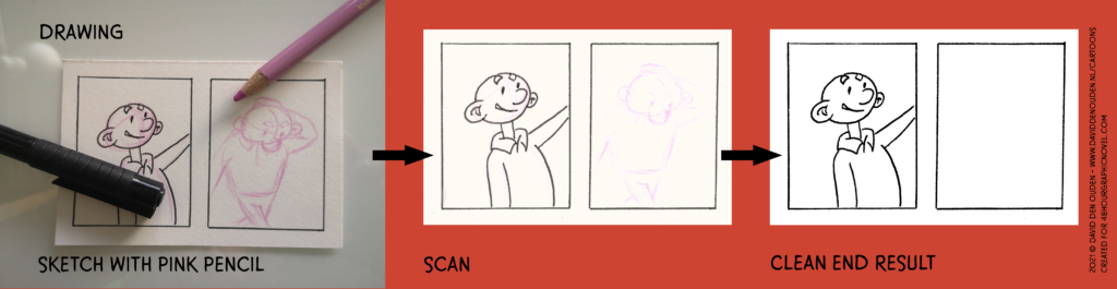
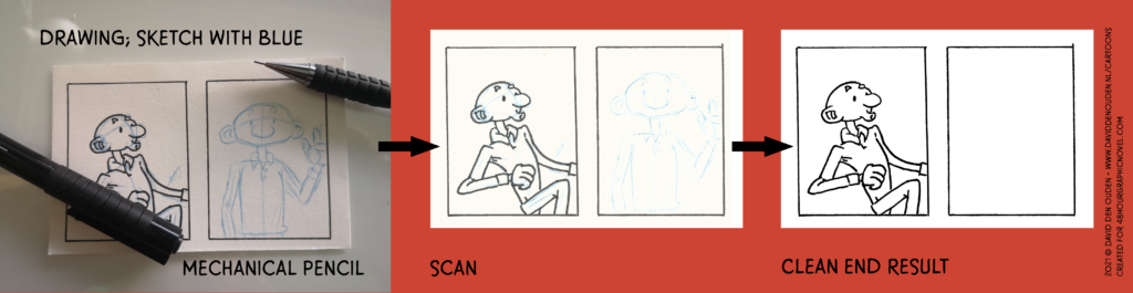
- If you ink your sketches directly (on the same piece of paper):
- Use a light coloured pencil or mechanical pencil (for the Dutchies: vulpotlood).
- RECOMMENDED: use a (non-repro) blue color! (this can be filtered out very easily, big time saver)
- E.g. I work with pink colour pencil and a blue mechanical pencil.
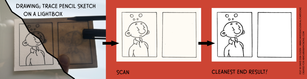
- Do not ink your sketches; use a light box or other tool to trace and ink your work on a new sheet of paper.
Working in gray
With the previously mentioned GNW’s we did not only work in black and white (= time saver, aka speed), but also in gray. Which can work very well. But you have to make sure you can print it in the same quality as the art work itself.
If you work in gray, for the final printed graphic novel, you want your blacks to be truly black and the gray to have all the nuances and levels as the original art work. You do not want your black lines to turn out dark gray or black-ish. It kills the page.
How to do the scanning properly, is described in the next section.
These practical tips we’ve learned the hard way; it will give you better quality and in the end save a lot of time.
- If you work in gray you have 2 options:
- 1. Add the gray to the black and white on the same sheet of paper.
- 2. Add the gray on a fresh sheet of paper (use a light box for gray).
So:
1. If you draw on the same sheet of paper:
- First draw the black and white (line) art.
- Scan the black and white sheet.
- Add the gray to your sheet.
- Scan the sheet and this is really, really important: scan the sheet with the same scanner and same orientation (upper right corner of your page) as the black and white sheet.
2. If you draw your black and white (line) art on one sheet and the gray on another (using a light box):
- Scan both pages with the same scanner and same orientation (upper right corner of your page).
- Add indicators (e.g. +) in the corners outside the drawing area so the 2 scans can be lined up perfectly.
Those 2 emphasised sentences are really important. I’ve learned the hard way with GNW Haarlem 2020. The art work was scanned in black and white at the event. Back home, doing post production, I scanned the gray page on another scanner. It was impossible to line up the 2 scans; rotating and correcting for distortions did not work. I’ve spent hours cutting up the gray scans of for pages in small pieces, panel by panel to rotate and deform them so they lined up.
Most scanners are not perfect and they all distort pages slightly different. So to compensate for that, use the same scanner. And the same orientation, since the scan might have small distortions from top left to bottom right. Rather have the same distortions in the same places.
Scanning the art work
Even if the artist is not scanning the art work themselves, it is good to be aware of the process.
- Scan at the highest possible resolution: 600 dpi (preferred), no less than 300 dpi.
- This leaves most room for adjustments, polishing up pages and high quality printing.
- The industry standard for American comics is 350 dpi.
- Save as TIFF and if that is not possible, JPEG.
- Scan as a photo, not a document:
- Even if you only have black and white line art.
- If your art work is black and white or gray scale (no colour on the sheet):
- Scan as gray scale (NOT black & white).
- If your final art work has unwanted colour:
- Like sketches in colour on the same page.
- Like with fancy comic art board paper with a blue print for panels.
- Scan as colour.
Digital art work
If all is fine, you work on the same format as the paper artists.
Preferably you work in 600 dpi. If that is not possible, at least work in 300 dpi.
The industry standard for printing comics is 350 dpi. Which can be an issue if e.g. you have (an older) non-professional version of Procreate. With just using black and white you should be fine, if you use gray scale as well, better check with the organisers of the GNW to see what will work.
Post production of the art work
We can’t do a whole course on Photoshop and post production here. But there are a few basic things we can mention.
You want the black and white (line) art to be truly that: just black and white.
In post processing we want to optimise the art work, so we have the best quality. If you scan as a document or black and white, the scanner takes all the decisions for you. And you want to make those decisions yourself in Photoshop (or another tool).
To create high quality black and white images, there are different approaches that all work.
I usually take the following steps for processing a scan in Photoshop.
For scans with colours (from pencil or art board paper):
- Especially with removing colour, there are many solutions. Pick whatever works best for you.
- Recommended for (non-repro blue):
- Create an new Channel Mixer adjustment layer and set the Preset to ‘Black & White with blue filter (RGB)’
- This method may still need some polishing up, but most blue will be gone swiftly
- Create an new Channel Mixer adjustment layer and set the Preset to ‘Black & White with blue filter (RGB)’
Or otherwise:
- Copy the background scan layer to a new layer; from this layer you will remove all the colour.
- With the magic wand with high enough tolerance and no anti-alias you can select the colours and delete them.
- Make sure not to accidentally select any gray scale you want to keep.
Next:
- Proceed with the following steps; use this layer without colour instead of the background layer (original scan).
For black and white (line) art scans:
- Copy the background layer to a new scan layer.
- Rotate and move the scan so it lines up with the final page template (panels in place, etc.).
- Most scanners have some sort level of distortion, so you might have to use a lens correction filter instead or other tools as well to restore the shape of the scan.
- Add Levels as an adjustments layer and optimise the levels;
- The white of the paper will be white with some margin (output level < 255).
- The output level of the black will start in the black ink range (so not just at the beginning level of the black spike).
- Add a Treshold as an adjustments layer and optimise what you want black and what not.
- Copy the scan layer and 2 adjustments layers and merge these layers.
- Select all white in the merged black and white drawing and delete the white.
- You now have a high res layer with a drawing where you can put a gray layer under, without any lighter gray edges.
- Add a white background layer.
- If needed, go back to the first step and optimise the levels and threshold.
For gray scale scans:
- Add levels as an adjustments layer and optimise the layers.
- The white of the paper will be white with some margin (output level < 255). You don’t want the paper itself to be any gray scale.
- The output level of the black will start at the beginning in the black ink range.
- Tweak the middle gray output level.
- Add other types of adjustments layers and optimise the grays.
- Copy the scanned background and adjustments layers and merge these layers.
- Select all white in the merged gray scale drawing and delete the white.
- You now have a high res layer with a gray scale where you can use under the black and white art work.
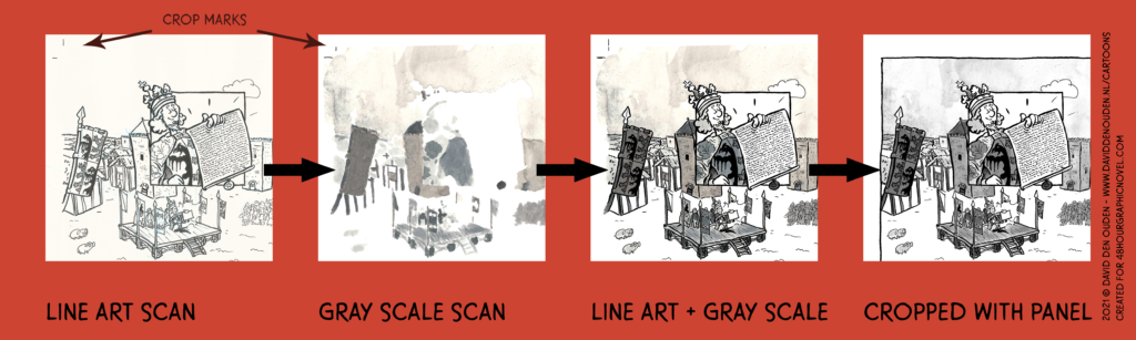
Next: Clean up the scan. Duplicate the layer with the art work (so you preserve processed scan). Erase all specks, errors and other things that should not be in final art work. Usually you do not want anything outside the panels.
Combine the processed gray art work with the black and white (line) art work and make sure they align. This can require some rotation or even a lens correction filter to align them perfectly.
Comments are closed.